


'We Have A New Sun Now'
Rooms at the end of the world

I spent part of yesterday watching videos from Apple’s Worldwide Developers Conference (WWDC). The live keynotes have been replaced by pre-produced videos that are painful to watch. They’re stilted and awkward and have the same kind of lighting as the product videos, which is eerie and fake-seeming.
So, in honor of that, I’m sending out this piece on design and video from last spring. There’s one dated political reference—see if you can spot it!
1. Life Before Portrait Mode
A few years after college, I noticed a trend in the photos my friends posted to social media. Every snapshot, vacation, and artisan cocktail was captured crisply in the foreground, with the focus falling off at the edges into a blurred background. When I saw my friends in person, I learned this was the result of their purchase of digital SLR cameras with lenses that had manual focus.
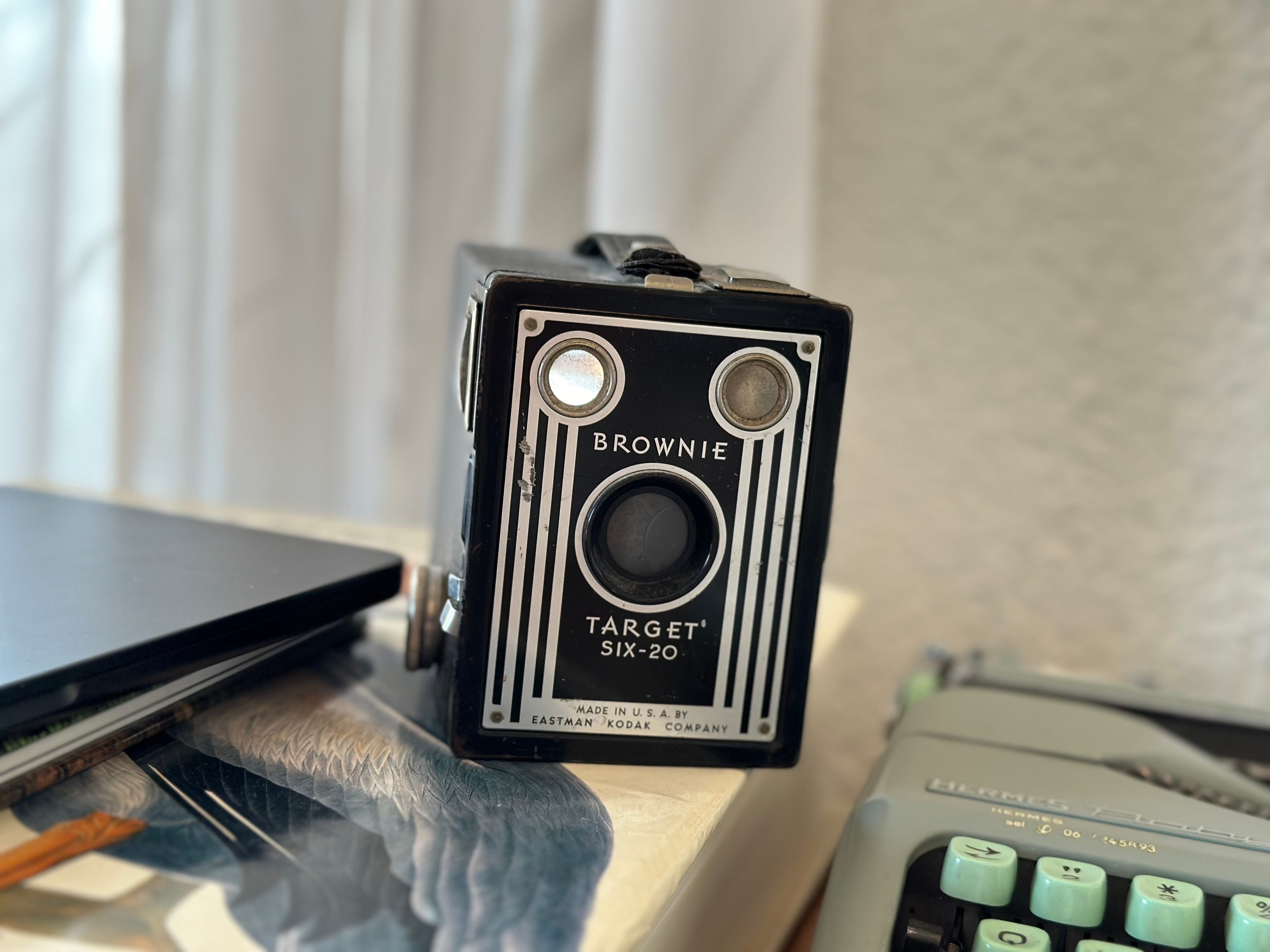
Seemingly overnight, the shallow depth-of-field look overtook the fake film filters of Hipstamatic and early Instagram as the signature aesthetic of our generation and class. We were young professionals finding our footing in life and we had just enough disposable income to buy a nice camera to document whatever might come next. Families have invested in cameras since the Kodak Brownie, but in the smartphone age, having a separate camera said something more. New homes, exotic trips, first children—these are moments that deserve real documentation, not a one-off tap from the same device we use to play Flappy Bird. Just like the events they captured, the shallow-depth-of-field SLR pictures signified a certain level of success and an elevated sense of taste to go along with it.
The effect looked good sometimes, but it was overused and often misapplied. No amount of driving the idea into the ground could keep it buried. Smartphone cameras improved. Portrait mode became standard. And soon, wonky terms like “bokeh” were common enough to be jokes in iPhone commercials.
2. Ecru’s Clues
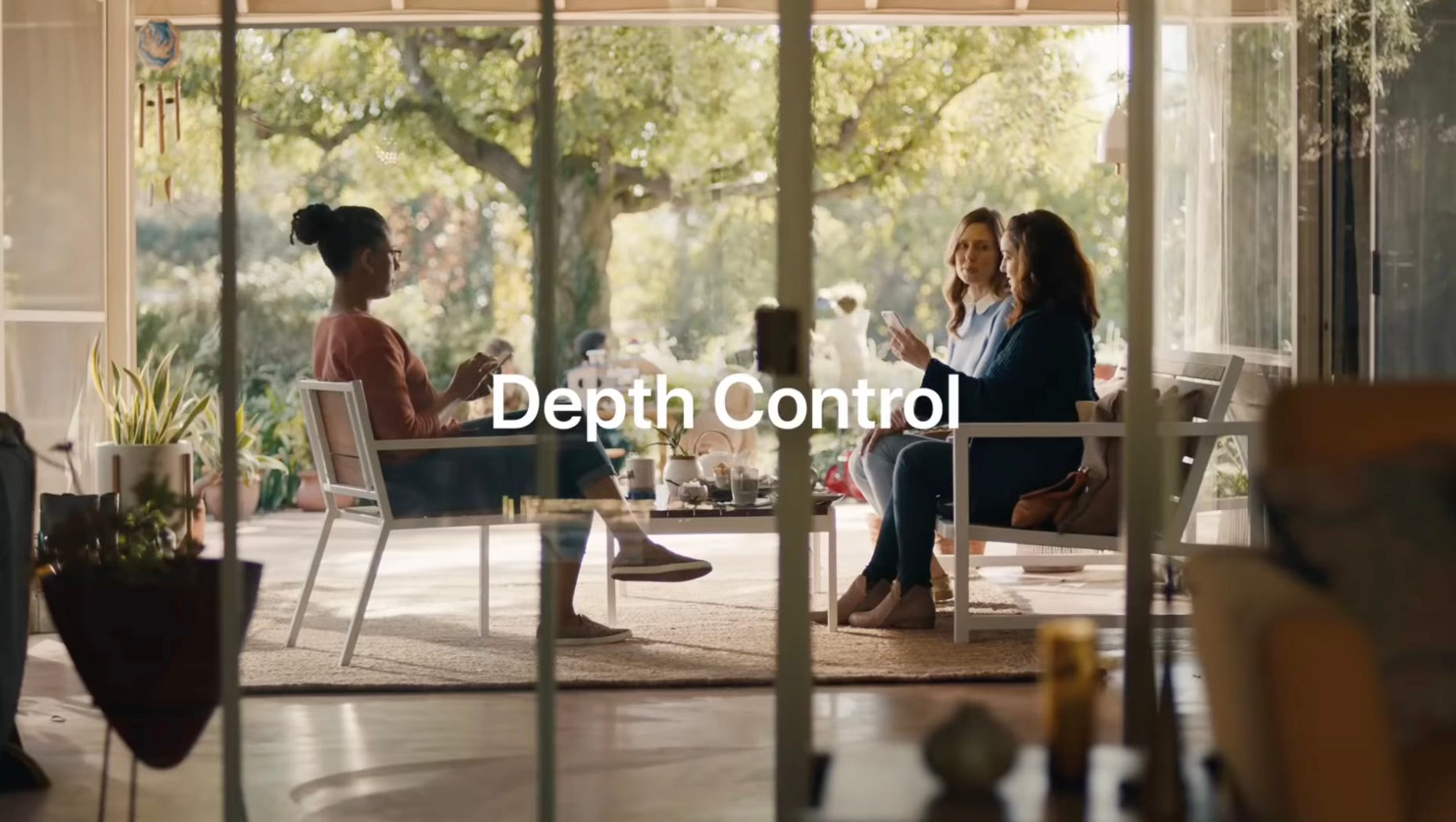
The point of the Apple ad is to show off a feature on a device with a roughly six-inch screen. To do this, the ad needs a gigantic house. The three adults sit in a well-appointed sunroom, surrounded by nice plants, wearing shoes on a tan carpet that’s placed over stone. The children play next to a large tree outside. The wide shots are shot from another room, also well-furnished. There are two walls of glass between the camera and nature, one wall between the closest people. Everything is a pale tan or light green. This is the home of people who make a lot of money, and the size of the tree outside says this isn’t some new-build McMansion; it’s established.
The people who populate this kind of space don’t need to buy a high-end camera because their phone is now a high-end camera, one they replace every year. Their attachment isn’t to a device they’ve learned to use, but to a system that quickly and easily produces images that fit with the aesthetics of their class and generation.
3. The Golden Hour at Fifteen Seconds to Midnight
What time of day is it in the “bokeh” ad? What time of year?
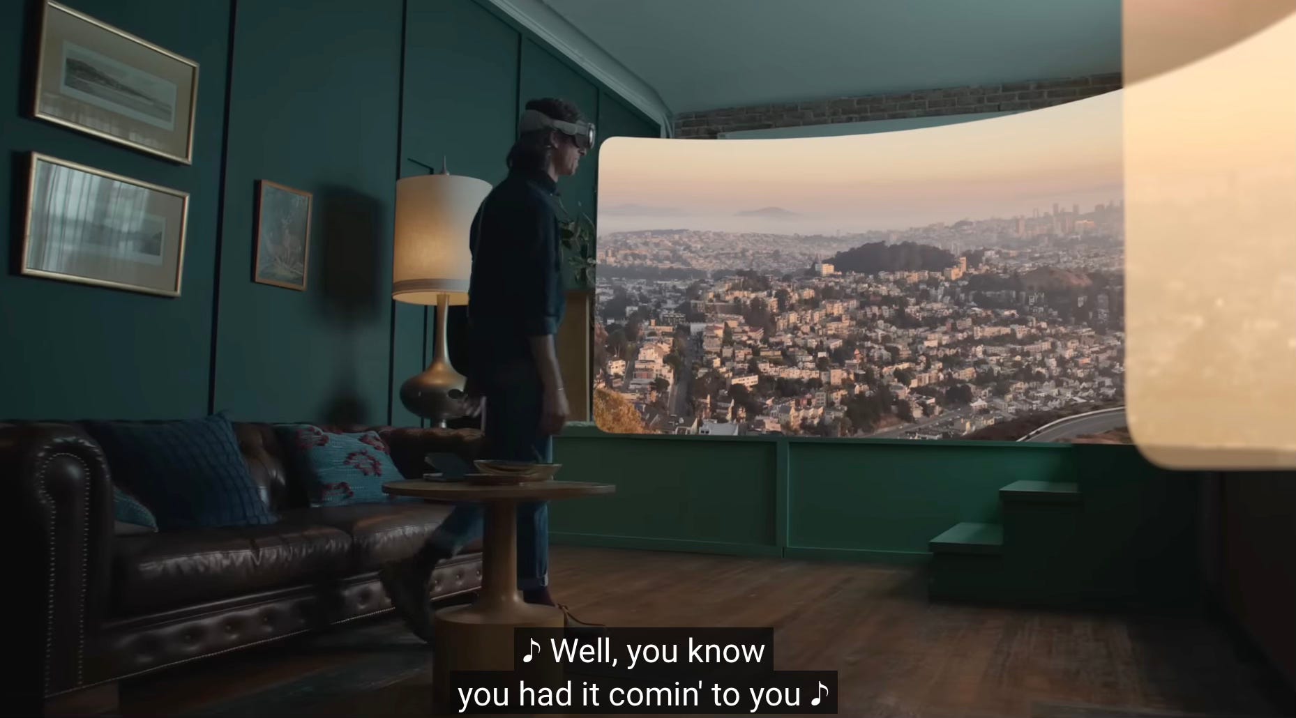
When the first promo videos for the Apple Vision Pro dropped, they seemed off, like they weren’t shot in the real world. Photo director Emily Keegin posted about the look of the videos on Instagram. “Apple chose a lighting direction & palette that is everywhereeeeeee at the moment. But especially prominent in interior-photography,” Keegin posted.
The elements of this aesthetic are (from Keegin’s post):
An extremely muted sunlight
The sun is out but has no real direction
Everything is mud. No sharp edges or bright lights
There’s a haze
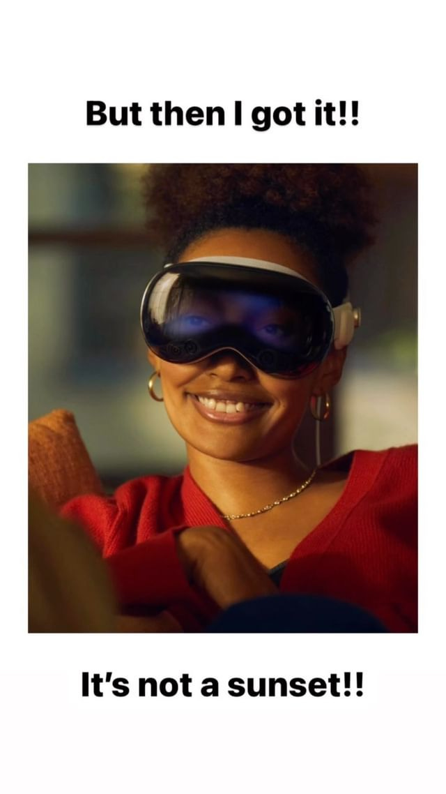
Keegin calls this “Wildfire Logic.” It’s the look a room inside when the sky outside is full of smoke and haze. “The old ways of the sun are done. We have a new sun now,” Keegin writes. In real life, this kind of light is unsettling. When wildfire smoke covered D.C. for a few days last year, to even look out the window was to confront impending doom, to be reminded of the consequences of our wasteful lifestyles. Fortunately, we now have a device we can look through instead. A new Vision Pro ad even features someone looking at a virtual presentation of a hazy skyline. In here, it’s always paradise. Version 2.0 will be even better
4. “Life Stuff”
Apple has set a lot of their recent commercials in what look like idealized upper-class Californian homes. These aren’t places where tech bros live in creepy minimalism. They aren’t real family homes, either, with clutter, furniture that’s a little too thin, and space that’s a little too tight. These homes have some of the old hippie vibe to them, but nothing dangerous or truly countercultural. There’s probably a half pack of marijuana edibles hidden behind a Whole Foods seaweed salad in the fridge. The houses look like they could be near a beach. They’re homes at the end of the world.
These ads aren’t memorable and even the inclusion of Apple products in every shot isn’t enough to make them stand out as ads for Apple. The company’s most memorable campaign (the “Get a Mac” ads) were famously shot in an infinity white room with no distinguishing features. Often, they didn’t even show the product.
When they did show the products, Apple ads didn’t show what those products actually did. The screens are off in this famous iMac ad:
There’s nothing in these ads that tells the viewer what they should do with the technology. In the “Get a Mac” ad above, Justin Long says Macs are better at “life stuff like music, pictures, movies.” There’s no suggestion of what a home movie or photo album should look like. The aesthetic idea, as much as there is one, is that a Mac user has slightly hipper clothes and would be into a computer that isn’t beige. Beyond that, the decisions are yours. You decide what your life looks like.
5. Aspirational Beige
The homes in these ads remind me of Paul Ford’s great essay The American Room. Ford noticed that so many videos online were set against the same tan backdrop. “The walls are decorated, although we can’t see the art. The same color on the walls, the same white doors,” Ford writes. “It’s a standardized room. Like Diet Coke or iPhones, American rooms are a kind of product, built as quickly and cheaply as possible to a standardized specification.”
The American room is the room where we use these devices.
I noticed these rooms a lot a few years ago when water bottle flipping went viral. On Vine and YouTube, people in beige rooms tossed half-full plastic water bottles in ways that always resulted in the bottle landing on either its bottom or its cap.
More than the rooms, I noticed the sound. It was the sound of thin plastic echoing in mostly empty spaces. I noticed the bottles, too. Why did everyone have so much bottled water? Were water crises that much more common than reported?
These rooms aren’t as common online now. Instead, posters use the automatic (and buggy) background removal tool to hide the beige walls. That, or the videos are set entirely in virtual spaces like Minecraft.
6. Of Course I’m Quoting Susan Sontag Here
Photography, generally, captures an image of the world through technology—a chemical reaction or a sensor. Yes, a person frames the shot, adjusts the camera, and takes the picture, but the role of a person in making a photo is very different from the role of a person in making a painting. In On Photography, Susan Sontag argued that by using “mechanical techniques which anyone can learn,” photography blurs "the distinction between authentic and fake, between original and copy, between good taste and bad taste.”
The quality of how something is made matters less than the fact that it is made at all, as long as it’s made to be consumed.
“All art aspires to the condition of photography,” Sontag wrote.
7. The Most Famous Room in America
The most famous room in America right now (or, as of early 2024 when I first wrote this piece) is probably a kitchen in Alabama.

Senator Katie Britt’s response to the State of the Union Address has been widely criticized for a variety of reasons. And some scrutiny has landed on the backdrop—a kitchen that seems over-planned yet under-thought. Does anyone actually cook and eat in this room? Does anyone enjoy being in this room? Does anyone have a room that looks like this?
Maybe they do, but they certainly don’t have one with light like that.
8. Uncanny Plateau
OpenAI has a new machine called Sora that makes videos out of text prompts. The company has been showing off the results.
These videos look strange. It’s not just the errors—the appendages appearing out of nowhere, the impossible construction of buildings, the way they’re oddly lumpy in some places but freakishly smooth in others—it’s the way they’re just one step too many removed from reality. They look like an imitation of an imitation. As if someone thought Wildfire Logic were how the world really looked, then sought to replicate it, but couldn’t get it right. In motion, the slightly less-than-real gravity adds to the effect. It’s as if the machine is describing something real that it has never actually seen.
The videos aren’t passable as real, but they are plausible as Internet Content. Sora is a machine that puts out images that fit the expectations of the viewer.
In spirit, the Sora videos remind me of the bizarre visual effects in modern movies and TV shows. Productions are rushed to the audience (and visual effects artists are mistreated in the process) with effects that look half-finished.


The vibe is less “look what we can do” and more “you get the idea.” It’s lazy on the part of studios putting this out. They assume we want quantity over quality. Often, the assumption is right. It doesn’t matter if something is good or if it connects to our real life, it just matters that it exists. We don’t expect quality, we just expect something. It doesn’t matter if it lasts. It doesn’t ask that we remember it; we’ll get more of the same next year.
The plan works as long as we accept that it’s close enough.